Cold spring
March 26th, 2013Sid’s “Droste Bobble hat”
March 18th, 2013Printers are phat!
March 18th, 2013The work of german artist Thomas Bayrle is on show at Wiels, and proves to me that printers are really wicked people! An incredible amount of really nerdy hand-drawn patterned prints cover the walls of the first floor of the contemporary art center. In the days before computer all of this will have been drawn and composed over a light table: a long process requiring a lot of patience.
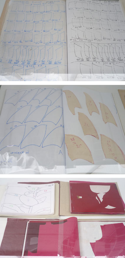
_– A little corner cabinet displays some of the process: a booklet of elements cut out in UV film, compositions and diagrams on how to organise the films when making the screens. Here the exhibition lacks information: I think that when you put on a show about an artist working with such specific techniques, the process should somehow be shown and explained either through photos, video or text. Its crucial to the understanding of the work: the time and the planning of the work are key elements that influence the final results. I think you can’t put on a silk-screening show like you put on a painting or sculpture show, you have to emphasize the process, you just can’t treat it as a secondary element.
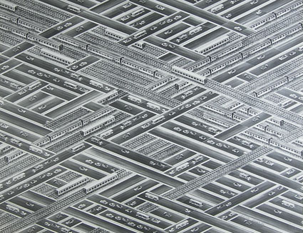
Patterns, patterns, patterns… drawings weaved together… in and out.. up and down…
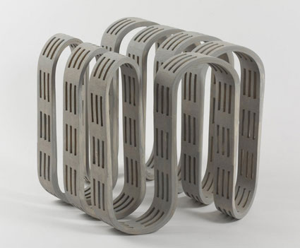
The second floor was dedicated to Thomas Bayrle’s 3D work. In fact 3D is clearly very important to him as it is already an issue in his prints. I wonder if its something to do with the flatness of silk-screenning? Does it become frustrating? Always seeking the perfect surface coverage… slickness…
In fact how do you deal with surface and depth when you are working with this technique?
Thank you Thomas, its great work!
Martin Meert
March 18th, 2013Bold Italic 2013
March 14th, 2013Another exciting edition of typography related lectures and presentations at Vooruit, organised by Michael Bussaer and St Lucas visual arts school.
http://www.bolditalic.be/
I particularly enjoyed these 3 presentations:
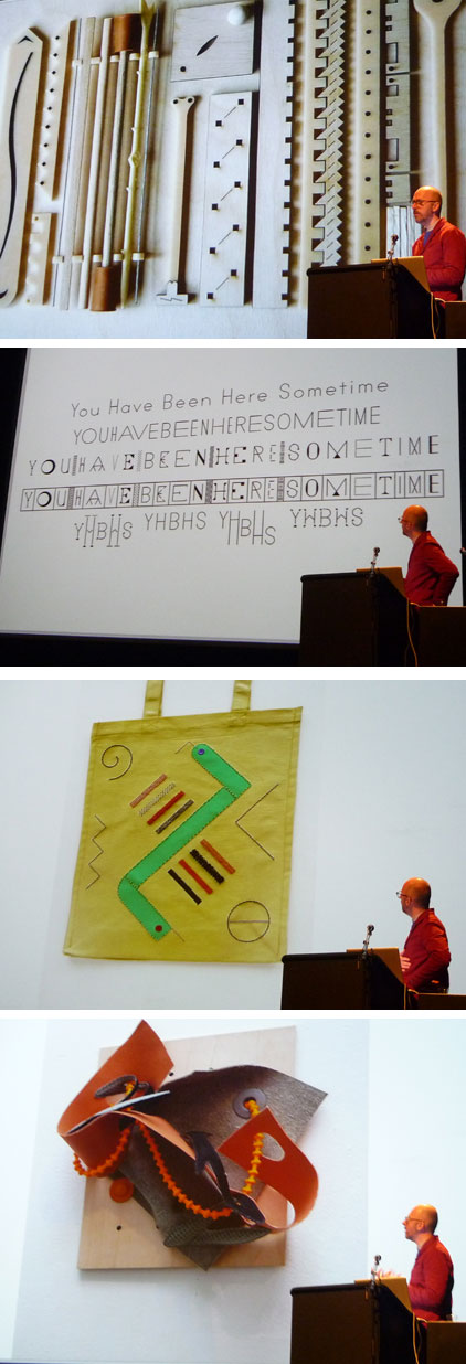
PETER NENCINI, whose work plays with systems and grids and mingles with textiles. The work deals with the curve and the linear, the rigid and the souple, organisation and had oc. It’s graphic and idea based and at the same time completely guided by form, texture and colour.
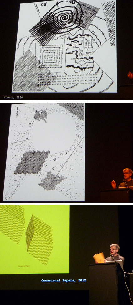
RICK POYNOR who gave a historical lecture about graphic/ poet “artist” monk DOM SYLVESTER HOUÉDARD who used the typewriter to make poetical/ typographic compositions.
Fascinating and inspiring!
FRANCOIS CHASTANET whose books “Pixação: São Paulo Signature” and “Cholo Writing: Latino Gang Graffiti in Los Angeles” I love and who has just published a new one all about the Chinese ground calligraphy phenomenon Dishu. He talked about this research and how he managed to approach the people and photograph them by showing his own knowledge of calligraphy, thus creating an exchange of techniques.

studio visit
March 13th, 2013Took my printing students to visit the shared Brussels studio of collectif Hell’o monsters.
It was really enthusiasing to see them preparing their futur exhibition at Agnes B in Paris.
We also met Silio Durt and Kostek both busy drawing and printing.


